BRAND IDENTITY & VISUAL SYSTEM
DONUT LOVE
The Donut Love brand was created for a new boutique doughnut shop entering the Tri-Cities market. The goal was to develop a distinctive identity that balanced playfulness with a sense of craft, avoiding overly “cute” tropes in favour of something more character-driven and memorable.
The work explored how personality, indulgence, and a slightly unexpected edge could come together in a cohesive brand system that felt both inviting and unique.
CLIENT:
Donut Love
DATE:
July, 2020
CATEGORY:
Brand Identity
OUTCOME
The final identity centers on a refined wordmark, chosen for its clarity, flexibility, and strong brand presence. Select elements from earlier explorations were carried forward and distilled into a more focused direction.
The result is a distinctive and adaptable identity that captures the brand’s playful personality while maintaining a level of sophistication suited for long-term growth.
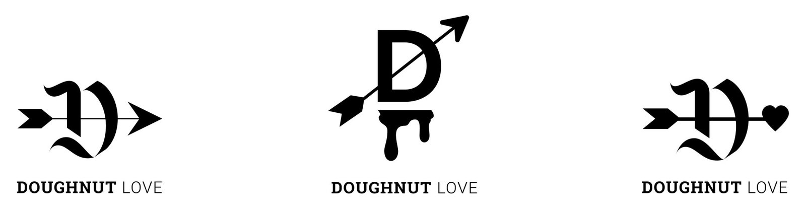
CONCEPT A | BOW AND ARROW
This direction explores the theme of love through a more unexpected and graphic lens. Inspired by the symbolism of Cupid, the identity uses a bow and arrow motif integrated into a custom monogram, creating a mark that feels bold, playful, and slightly irreverent.
Paired with a Gothic-inspired type style, the result introduces contrast and personality, balancing romantic reference with a sharper, more distinctive visual edge.
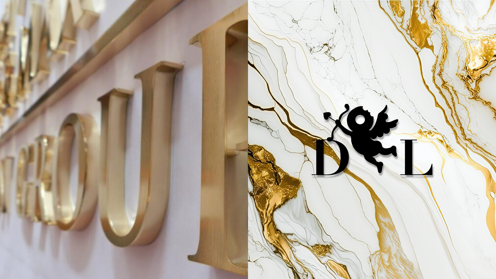
CONCEPT B | CUPID ICONOGRAPHY
This direction leans into a more expressive and character-driven interpretation of Cupid. The identity introduces a stylized figure that adds warmth and charm, while a refined serif wordmark helps anchor the system and maintain a sense of balance.
The combination creates a brand that feels approachable and memorable, with a visual language that can extend naturally into signage, packaging, and in-store applications.
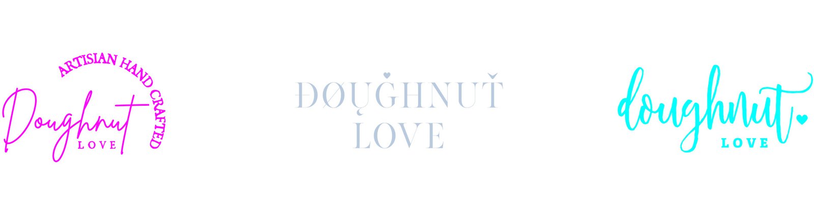
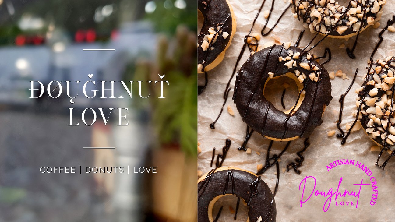
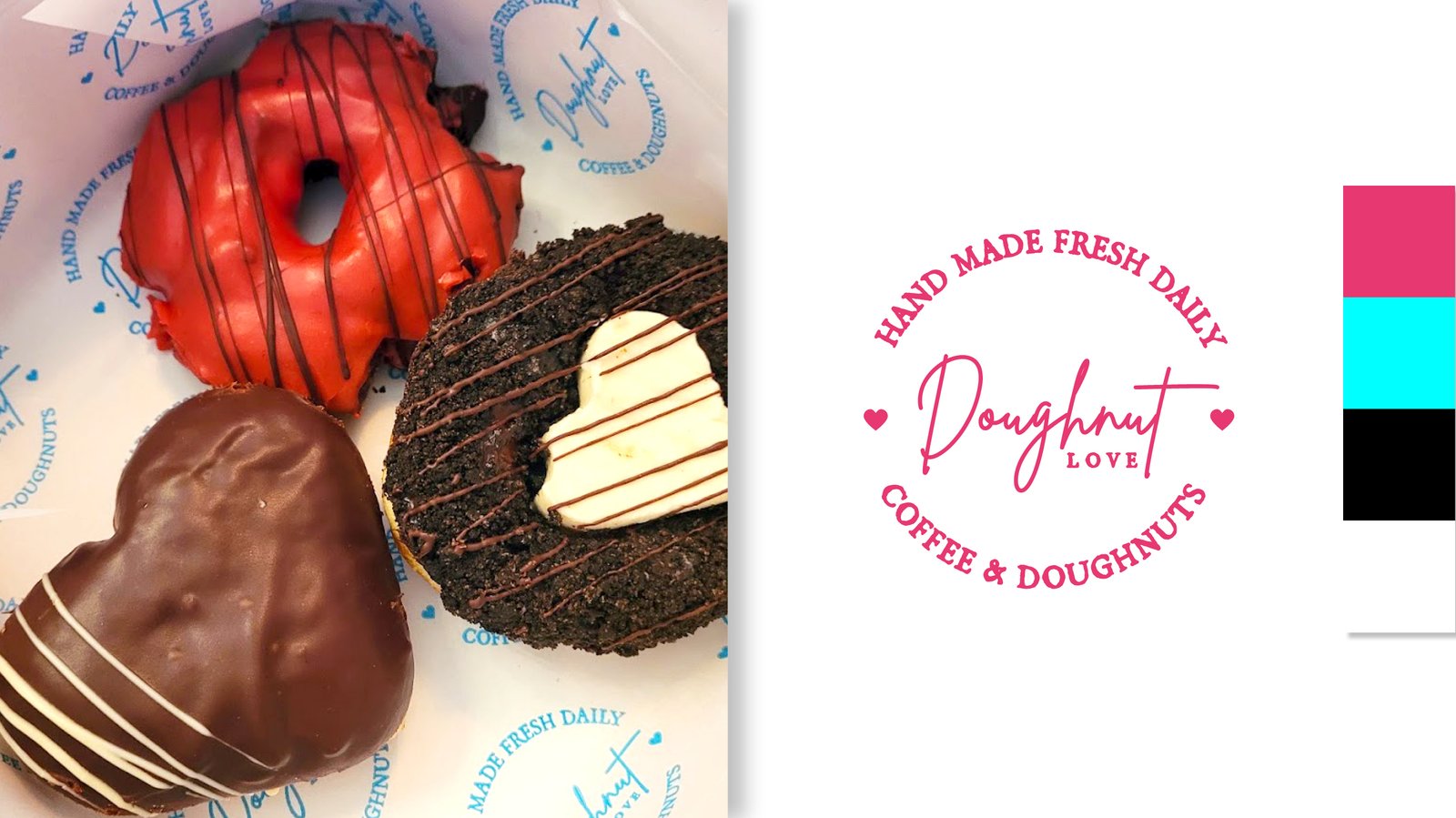
CONCEPT C | WORDMARK
This direction focuses on typography as the primary expression of the brand. A series of custom wordmarks were explored to capture a sense of joy, indulgence, and personality while maintaining a clean and timeless foundation.
The approach prioritizes flexibility and recognizability, allowing the identity to adapt easily across applications while still feeling distinct and ownable.