CAMPAIGN IDENTITY & EXPERIENCE
Circular Economy Solution Series
The Circular Economy Solution Series brought together leaders across industry, government, finance, academia, and NGOs to accelerate Canada’s transition toward a circular economy. The identity needed to feel credible, modern, and systems-oriented while remaining accessible to a broad, cross-sector audience.
A visual direction was developed to translate circularity, regeneration, and momentum into a clear and cohesive brand language. The work explored multiple pathways, from Nordic restraint to symbolic abstraction to nature-led systems. Each direction was designed to express continuity, progress, and interconnected thinking.
The final identity was built to scale seamlessly across touchpoints, including event branding, digital communications, presentation assets, and supporting materials. The result is a cohesive and adaptable visual system.
CONCEPT DEVELOPMENT
The identity exploration was grounded in the values and origins of the Circular Economy Leadership Coalition, drawing from themes of circularity, regeneration, and systemic thinking. Three distinct creative directions were developed to express these ideas through different visual lenses.
Each concept translates continuous cycles and interconnected systems into a cohesive visual language. Form, colour, and typography work together to communicate progress, resilience, and long-term impact. The system was designed to remain flexible and scalable across a wide range of applications.
ROLE
Creative direction and identity development, including concept creation, logo exploration, typography, colour framework, and visual system development for rollout across event and communication materials.
CLIENT:
Profoundry
DATE:
September, 2021
CATEGORY:
Campaign & Events
OUTCOME
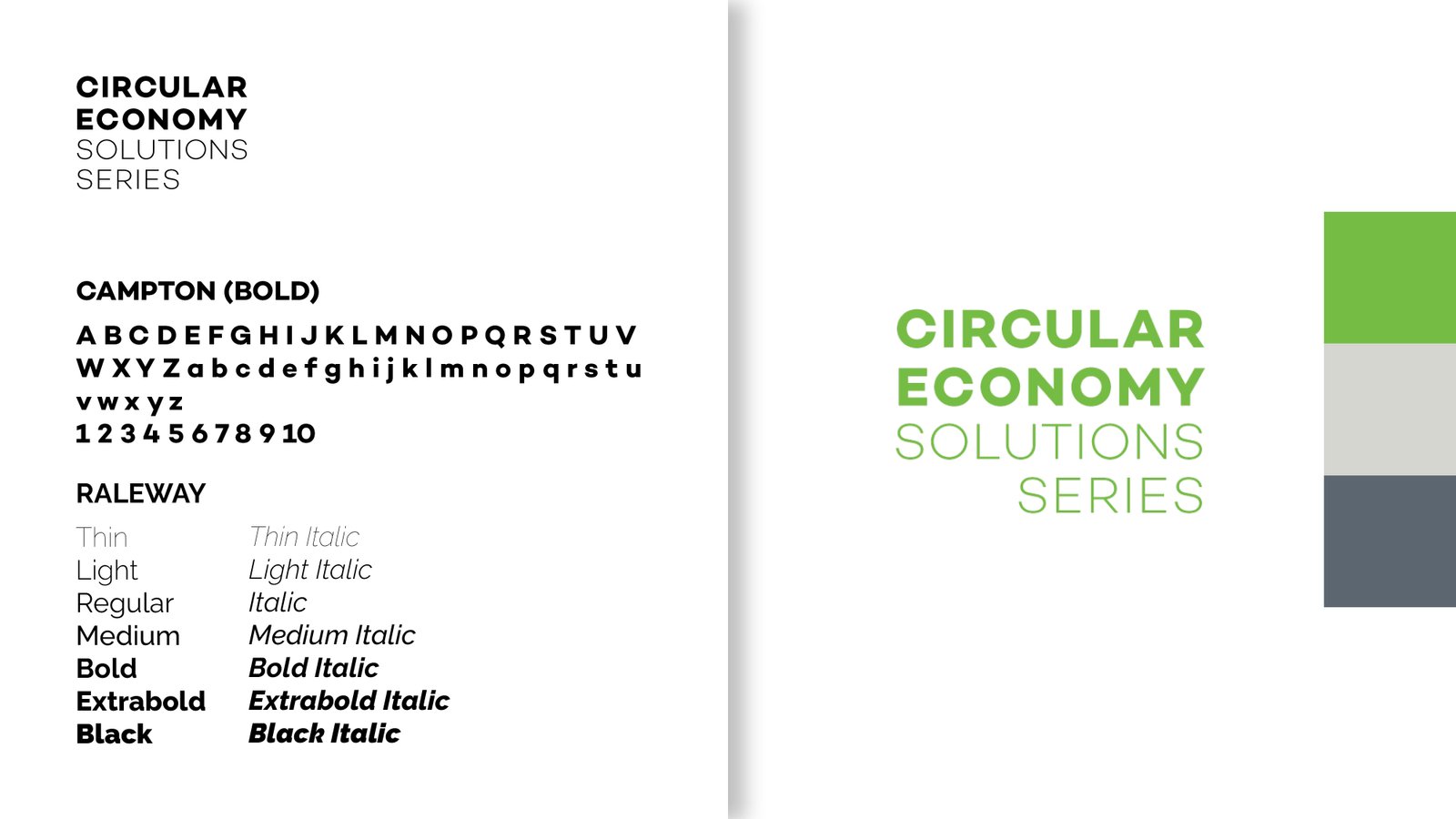
The final identity system was distilled into a refined wordmark and colour palette, combining clarity with flexibility across applications. The selected direction draws from the principles explored in Concept C, evolving into a more vibrant and contemporary expression of circularity.
The resulting system supports consistency across digital and print touchpoints, providing a scalable foundation for ongoing communications and future iterations of the series.
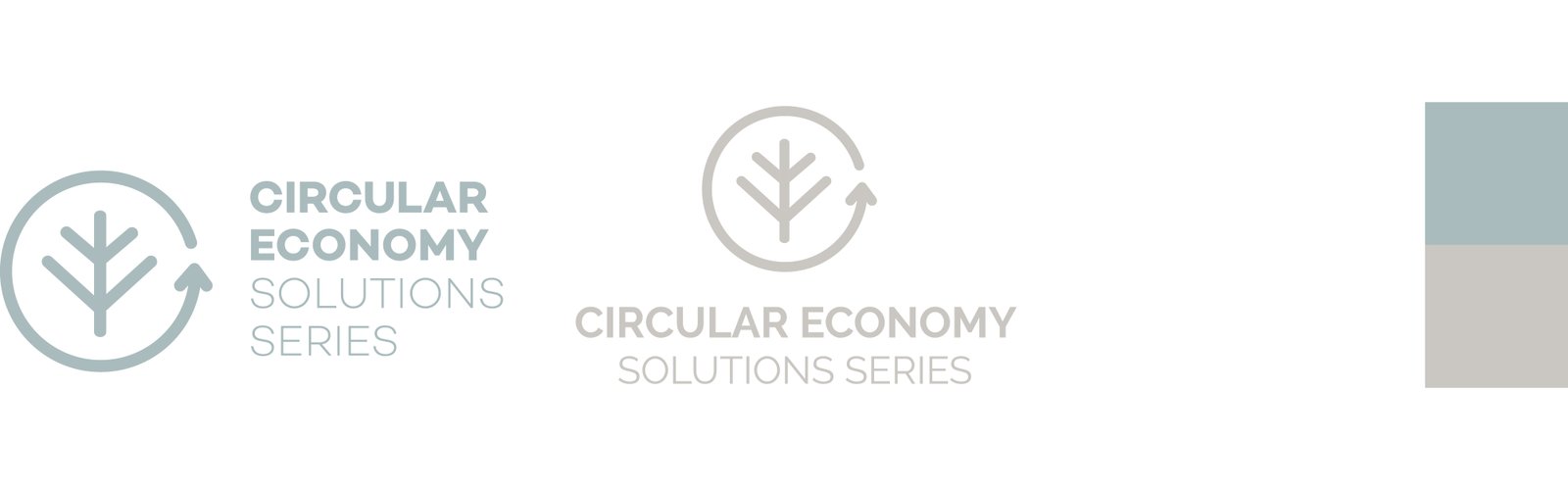
CONCEPT A | Nordic Minimalism
This direction draws from the organization’s Nordic roots, embracing a design language grounded in clarity, restraint, and functionality. Influenced by Scandinavian principles, the identity is defined by clean geometry, minimal forms, and a muted, nature-inspired palette.
The strength of this approach lies in its simplicity—creating a calm, considered visual presence that reinforces themes of balance, sustainability, and longevity.
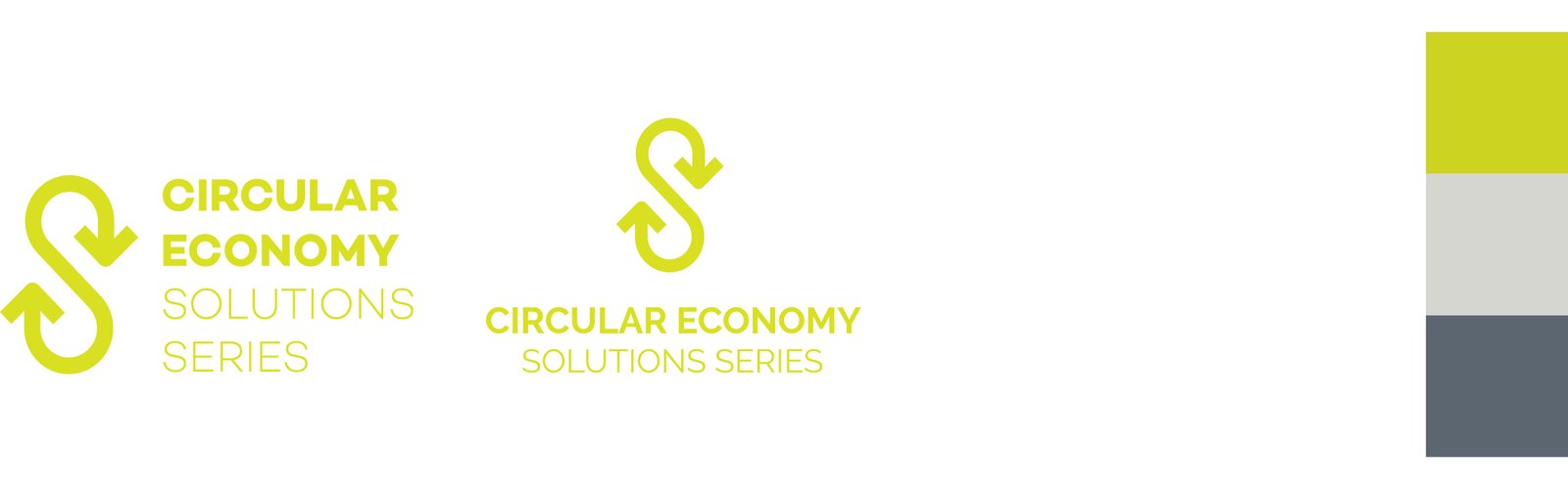
CONCEPT B | Symbolic Continuity
This direction explores continuity through a bold, distilled symbol. Derived from the infinity loop, the form is manipulated to suggest both circular motion and the letter “S,” resulting in a distinctive and ownable mark.
The identity communicates ongoing progress and interconnected systems, capturing the essence of circularity in a simple, highly recognizable form.
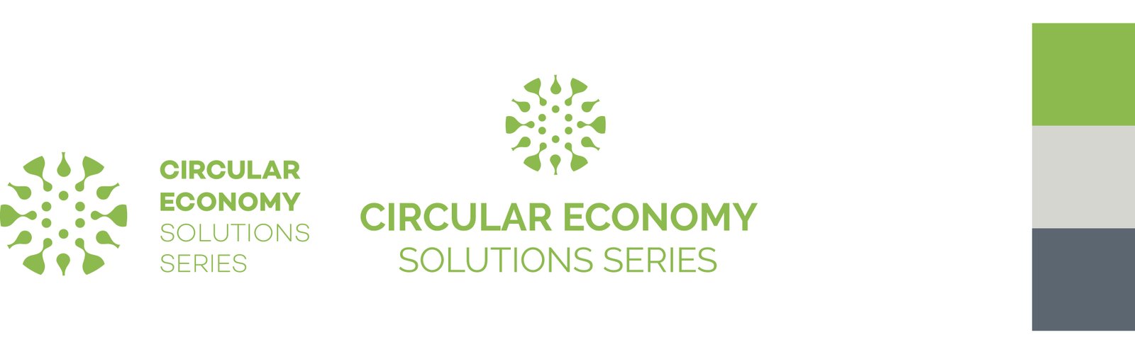
CONCEPT C | Regenerative Growth
This direction draws from natural systems of propagation and renewal—where growth emerges through interconnected parts and continuous cycles. Inspired by the geometric logic of flowers and plant structures, the identity translates these patterns into a cohesive and scalable visual mark.
The result is an organic yet structured system that reflects regeneration, resilience, and continuous evolution.