BRAND IDENTITY | CASE STUDY
Circular Economy Solution Series
Presented by the Circular Economy Leadership Coalition, and powered by GLOBE Series, the Circular Economy Solution Series is where Canadian leaders from industry, government, finance, academia, and NGOs accelerate the transition to a circular economy and capitalize on the trillion-dollar opportunity. The Circular Economy Solutions Series was an important stepping stone on the road to the World Circular Economy Forum, which Canada hosted September 13–15, 2021, in Toronto.
Covering a diverse range of topics, the series was designed to generate action and outcomes via virtual dialogues, webinars, breakout discussions, roundtables, workshops, online surveys, and curated matchmaking. The program covered circularity in all parts of the economy, including chemicals, bioeconomy, extractive industries, consumer products, finance, technology and innovation, cities and the built environment.
OBJECTIVE
To create a bold and memorable logo for the Circular Economy Solutions Series.
INSPIRATION
The values and history of the Circular Economy Leadership Coalition offered a rich source of ideas and concepts, guiding me towards three main themes: the organization’s Scandinavian roots, concepts and shapes revolving around continuation, and the inherent ability of the natural world to grow.
CLIENT:
Profoundry
DATE:
September, 2021
CATEGORY:
Brand Identity
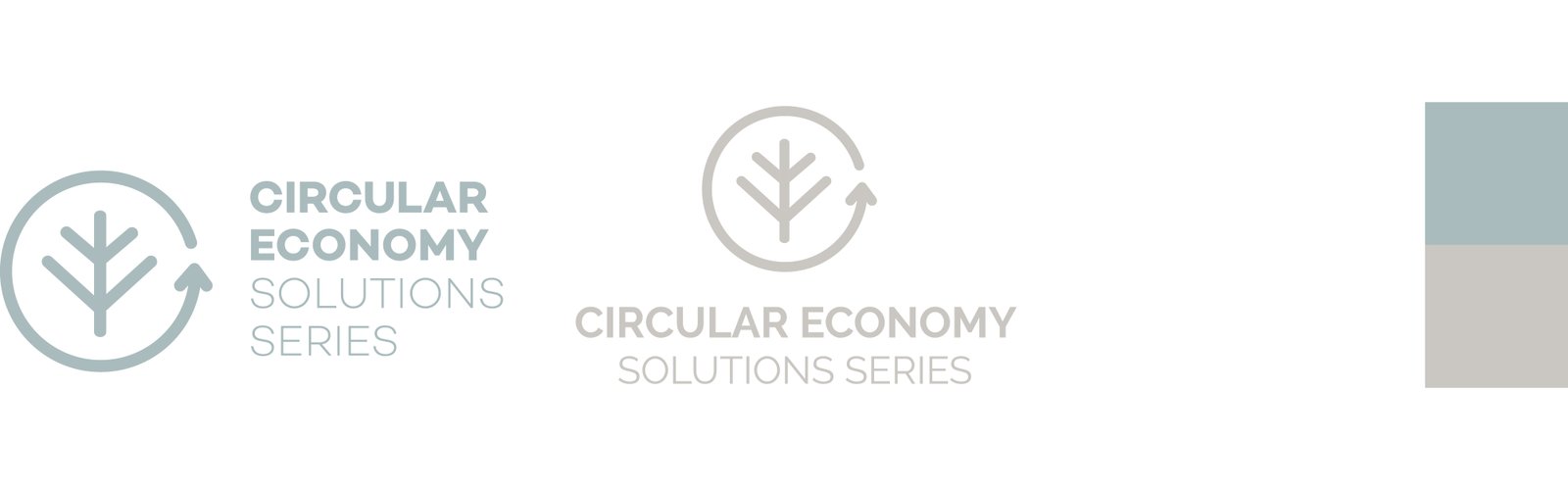
CONCEPT A | Scandinavian/Nordic Style
Here, I aimed to pay homage to the organization’s Nordic roots. Drawing inspiration from the Scandinavian design aesthetic, which champions minimalism and functionality without compromising beauty, the strength of this concept lies in its simplicity, incorporating clean lines and natural hues.
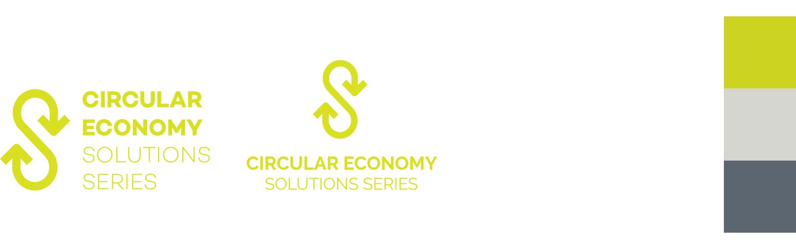
CONCEPT B | Infinity Symbol
In developing this concept, my aim was to create a bold, distinctive mark that embodied the circular and ongoing nature. By manipulating the infinity sign, I inverted and flipped it to resemble the letter ‘S,’ resulting in a unique logo. I appreciate this straightforward approach as it effectively encapsulated the concept with clarity and confidence.
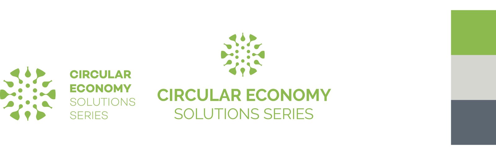
CONCEPT C | Nature and Regeneration
This concept draws inspiration from the propagation of flowers and plants, a process where new growth emerges from various sources such as seeds, cuttings, and other plant parts—essentially giving birth to something new and regenerating natural systems. I’ve long admired the symmetrical and geometric organization inherent in flowers, and found these qualities seamlessly translated into a stunning brand identity mark.
SUMMARY
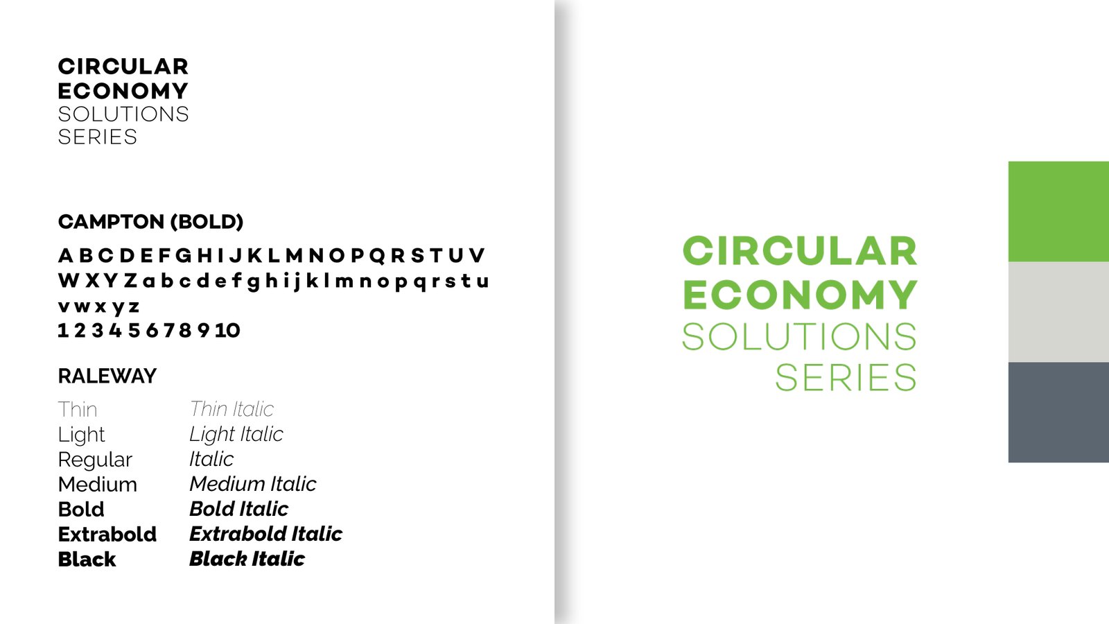
In the end the client chose to proceed with just the wordmark, adapting the color palette from Concept C with an updated green color using the Campton font. For the main copy font we went with Raleway as it had a versatile large family that would work well both online and for print.